.jpg)
Monday, 10 May 2010
Merchandising: Susie Doozy Plushie
.jpg)
Sunday, 9 May 2010
Titles (Short Version) - Motion Test
Here is a short title sequence I created using After Effects and Premier. I made the credits using Premier because it has a feature called the Title Designer that I never used before. Although, the feature provides a lot of ways to edit text, it gives me very limited animation options, so from now on I will probably edit the whole thing in After Effects.
As for the titles itself, I am very happy with the way it is turning out. It has the feel that I am looking for. I am learning a lot of things with this activity, one of which, is synching video to sound, as title design involves designing to a rhythm.
Final Characters
 Here are the final character designs that I am using in my project. Susie Doozy is the protagonist and the main character. She is a sweet, innocent little girl with a knack for getting into all sorts of clumsy situations. She is a frequent victim of Bad Tyke Jake (error in the name above), a notorious neighborhood bully. When Bad Tyke Jake gets especially mean, Susie cannot handle him all on her own and seeks advice from the mother of all wisdom, Mama Doozy. Mama Doozy is a 50s style housewife but Susie sees her as more of a superhero, as Mama always comes to her rescue when she is in need. I tried to get these qualities across in her design.
 With all of the character designs, I tried to keep them as simple as possible so that they read well in different situations and mediums.
Friday, 23 April 2010
Chuck Jones' Cartoons
What I really like about animation from the 60s is that a lot of it was very experimental and the narrative was often driven by a musical rhythm. Warner Bros. released a series of cartoons called "Merry Melodies" which fell under the brand "Looney Tunes". A lot of those were very inventive from an animation viewpoint, and gave us a bunch of very memorable characters such as Buggs Bunny, Daffy Duck, Tweety and Sylvester and so on. The only thing that I didn't like much about them is that sometimes the narrative fell into the "cartoon cliche" trap. Especially, when a situation was resolved with the use of dynamite or an anvil falling on someone's head and thus achieving a comedic moment. Personally, that is a formula that has become too predictable and I much prefer something that doesn't have to rely on violence for comedy.
Chuck Jones was a very famous animator at Warner Bros. and he was one of the most experimental at the studio. The plots are very unusual and the characters are very well animated. It is also interesting to note how transitions are used to switch from one scene to another. I like how unpredictable the cartoons are, as they have a certain surreal feel to them.
Here are some of my favorite of his cartoons.
Iconic Title Designers: Maurice Binder
What Saul Bass was to America, Maurice Binder was to England. Binder was another brilliant and iconic designer, best known for his James Bond titles. He created the infamous diafragm with bullet shot followed by a prologue sequence, that we still identify with James Bond today. His other signature motif in the James Bond franchise is the use of the silhouettes of the female body in each of the title sequences. It seems that Binder went further than just designing movie titles. When you think about it, he designed the packaging and a movie brand image that still lives on today and that is very facinating for me.
However, Binder's design work was not just limited to James Bond. He concocted some brilliant designs for films such as "Charade" (1963), "Two for the Road" (1967) and "Arabesque" (1966), to name a few.
Binder's style was effective because it was always very conceptual and employed a lot of different graphic experimentations, such as the use of texture, film overlay etc. He was also great at using colour. His visual experiments are particularly fun to compare to the current Photoshop era. The design process today is mainly digital whereas before it was largely manual.
Like Saul Bass, he liked to use geometric shapes that came together into a very rhythmic motion sequence. Here is some of his body of work.
I couldn't find the "Two for the Road" sequence on YouTube but I managed to find it on facebook. Here is the link:
Thursday, 22 April 2010
Iconic Title Designers: Saul Bass
Saul Bass was a graphic designer who became known as somewhat of a founding father of the movie title sequence. He had a unique geometric style with crisp shapes (often created out of paper) that logically came together into a balanced composition. The style was very minimal, yet modern. Simple, yet sophisticated.
Over the course of his 40 year career he designed for high profile directors such as Alfred Hitchcock, Stanley Kubrick, and Martin Scorsese.
Here are some of my favorite titles of his and some of his most famous body of work.
Labels:
60s,
animation,
graphic design,
motion graphics,
Saul Bass,
titles
Tuesday, 30 March 2010
Self-Directed Project: "Suzie Doozy"

Remember these? Of course not because I never posted this but these characters are old and were part of my failed experiment to create an animation out of them. If anyone wants to have a read about my previous project, head to:
Then I decided to make character driven animation shorts, but that task soon became too big for me and very quickly the project I set for myself became less fun.
So I went away to figure out my strengths and weaknesses. I know that I am strong visually and have a penchant for all things illustration. I also like to experiment with different media, both digital and traditional. I still have lots to learn technically and there is little time so its best to not give myself any tasks that I know that I would not be able to handle.
So, now I decided to update my previous project to better suit my strengths. The project is now fully about character development. I will use some of the existing designs from my previous project to develop a tv show title sequence and a trailer to advertise it and merchandise (a little plush toy comes to mind). The idea is to explore the strength of a character and its readability in different forms and mediums. The main character I am focusing on is "Little Girl". I am very happy with her design and I think that the character has a lot of potential, in terms of application in different media. As of now she will be known as "Suzie Doozy". The reason "Doozy" is Suzie's last name is because she always gets herself into trouble when she expects it least and it becomes a "doozy" of a problem for her!
For those that don't know what "doozy"means, here is a definition:
Doozy (plural doozies)
1. (US) something that is extraordinary. Often used in the context of troublesome, difficult or problematic, but can be used positively as well.
2. Most of the test was easy, but the last question was a doozy.
I feel the name "Suzie Doozy" has a nice ring to it and it will be the title of my hypothetical animation series made for tv.
Next we have the antagonist. "Bad Tyke Jake" is the neighborhood bully and everyone fears him and he always seems to pick Suzie as his victim. At times of crisis, Suzie seeks help from her mum, "Mother Doozy", who is part 50s housewife, part superhero who's job is to save and aid Suzie in her moments of trouble. I will outline the characters in greater detail in later posts.
So, what will I be submitting:
1. Folio of concept art.
- character development (characters in rotation, poses, etc)
- style guides
- color script
- animatics (one for trailer, one for opening credits)
2. TV show advertising spot/s (trailer)
- 2D animation produced in After Effects.
- This piece will show the characters as they would normally appear in the animated tv series.
3. Opening Titles
-Aesthetic style reminiscent of legendary title designers Saul Bass and Maurice Binder
- The characters will be very stylised and stripped back to its most basic geometric form made out of cut out paper pieces. This piece will be a test of strength of the character design.
4. Merchandising
- a plush toy of "Suzie Doozy" to explore the character in 3d form, which is also tangible.
-a printed piece such as postcards or a poster.
More details later.
Installation Art: "Curious Murder"
We finally finished the video with our installation art concept.
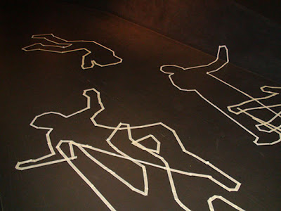
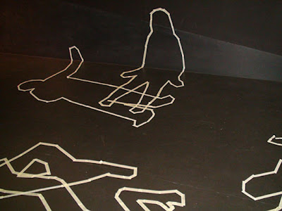
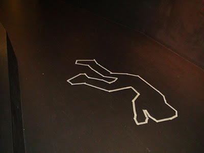
Our hypothetical exhibition runs for 5 days. There is a body outline on the floor on the first day and on each new day a new outline/s appear. The objective is to study human behaviour, that is, how do passers-by react to the installation. Are they curious? puzzled? camera shy? or just ignore the whole thing. It was interesting to see how people began to use the space with the new elements installed.
Tuesday, 23 March 2010
"Crime" Outlines


Today we shot our footage for our Installation Art project. Technically we were supposed to do that tomorrow but another group has chosen the same location as us so we couldn't film.
Our chosen location is the Black corridor in the Architecture building. There were several reasons for our choice:
- It is black and our subject/s contrast well against the background.
- There is a constant flow of people travelling between buildings.
- The corridor can be easily accessed, which allows us greater freedom whereas filming is concerned.
At first, we were planning to film the people's reactions to outlines only, but we quickly realised as we were setting up, that people seemed interested in what we were doing so we documented that as well.
As a result, our installation now has 2 experimental conditions: during set-up and post set-up.
Above are some photos of the outlines.
Tuesday, 16 March 2010
Installation Art
Now that we have finished with modular experimentation, it is time to move to part 2 of the project, which has nothing to do with part1!
Our team (and the other teams) have to come up with an intallation art concept that uses a specific location (of our choice) anywhere on campus. Due to the lack of materials, funding, building permits, etc we are not suppose to actually build it but to make it just look real.
As soon as we were given the brief, our group seperated for the weekend for brainstorming and came back on Monday to discuss ideas. It was easier to see what each individual in the group wanted to see in the final concept and to ultimately come to a final decision.
Notably, the gameshow that is known in Australia as "The Hole" came up and the whole idea of silhoettes or holes through which, people can climb through and this way people could use the space as a type of playground. The issue of practicality arose and we had to expand on the idea. Then the silhouettes got us thinking about crime scenes, for some reason, and how body outlines can look cool!! Weird.
...And we settled on that. Our installation concept became art/social experiment. More on that later. :)
Friday, 12 March 2010
Modular Madness Completed!!
I wrote in my previous post that our team was working on producing a stop motion animation piece with our modular system as our key subject. The narrative aims to explore the system's maximum construction potential.
I am pleased to announce that we finished and here is our final result:
Saturday, 6 March 2010
Making Cardboard Prototypes/Alchemy Studio
This semester the Multimedia students are collaborating with the Architecture students. We learn how to make models and they learn how to use software like After Effects. So we both learn something new. On Thursday we had to create 3 modular structures out of boxboard. We weren't allowed to use glue or any other adhesive to connect the pieces together so we had to come up with a seperate technique for each of the structures. I used the slot, the tab and the groove techniques and I also used scoring and that helped me to bend the thick cardboard into a more desirable shape. Unfortunately, I misunderstood that we were actually supposed to post pictures of our experiments on the blogs, so I actually threw mine out, thinking that I won't need them anymore.
Later in the day we were formed into groups to work on the first part of our assessable assignment, which is going to be a stop motion animation. This is what one of my group member's modular system looked like:


 The group decided to use the prototype that was already made in class. The prototype pictured directly above, offers many manipulation possibilities. It is simple on its own, but is capable of being constructed into complicated shapes. Each piece joins to another via slot system, in other words, each piece is fitted with multiple slots for greater shape possibilities.
The 30 seconds of animation that we are required to shoot, is to explore the potential of the modular system through a visual narrative that our group has to come up with.
Shooting day - Saturday
Update: ...And a bit on Sunday due to horrific weather today in the second half of the day!! :(
Special message for the blog! :)
Hi Blog. I didn't write in you for a while. Been neglecting you (not good). But I will rectify the situation starting from today. I went through some ups and downs and bumpy rides and a long pause (the process kind of aged me in the process too, lol!) Now it feels good to start the year from a clean slate and with the mind in the right place. Here's to a good year! :)
Subscribe to:
Posts (Atom)